|
|
Post by KRoseLynn on May 4, 2009 9:38:43 GMT -10
It was a hard decision to pick just three... #1 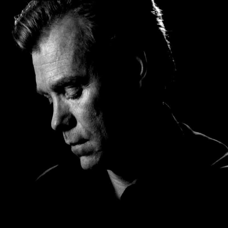 #2  #3  |
|
|
|
Post by sanne on May 4, 2009 9:43:25 GMT -10
My vote would go for #2 or #3....I think #1 is a wonderful pic, but too dark as background..... Sandra  |
|
|
|
Post by KRoseLynn on May 4, 2009 9:50:46 GMT -10
Yeah, I've thought of that, but I can lighten it up a bit. I'll also change the font color to white, or even a light gray.... I personally don't like reading white on black, but some prefer it. And it's such a beautiful picture of him... I vote for #3 though.  |
|
|
|
Post by sanne on May 4, 2009 9:53:21 GMT -10
I voted for 2, but I can live with 3 as well...... ;D Sandra |
|
|
|
Post by jessica on May 4, 2009 9:55:58 GMT -10
I voted for #3 since I'm not a big fan of him in a white suit.  One is the best picture I have to say... I just have problems with reading white text on black background...  Jess |
|
|
|
Post by margaret1234 on May 4, 2009 10:07:03 GMT -10
Didn't realise we were allowed to post here. I was the first one on and voted for ONE.....gorgeous picture. I have never liked the white suit. If the the first one is difficult why would this not apply to the white one as well.  Margaret |
|
|
|
Post by ohiogranny on May 4, 2009 11:28:42 GMT -10
Although all of the pictures are excellent, I don't like any of them for a background. Number 3 is the one I'll vote for but the other people around him will be distracting unless they can be eliminated. I'm sure Kroselynn is up to this.
Karen
|
|
|
|
Post by gonsy on May 4, 2009 11:40:10 GMT -10
Yeah! My vote goes for number 2#! ;D Gonsy |
|
|
|
Post by tanyadell on May 4, 2009 12:11:36 GMT -10
well you said pick your fave so I did....I love #1 although it would be hard reading thru it...it's a good picutre but #3 would be easier to see thru
tanya
|
|
|
|
Post by jstyle on May 4, 2009 12:24:16 GMT -10
I picked # 3. Gorgeous eyes starring at me. Although I like the first one too, like the ladies said, might be a bit too dark.
Jessica
|
|
|
|
Post by margaret1234 on May 4, 2009 13:20:24 GMT -10
The first one may be dark but as Krystal says it could be lightened and High Pass Sharpen would lighten it even more. It's alright just voicing my thoughts out loud. ;D I know when I am beaten. Would settle for the third one .....although not a favourite. Margaret |
|
|
|
Post by KRoseLynn on May 4, 2009 15:40:35 GMT -10
Although all of the pictures are excellent, I don't like any of them for a background. Number 3 is the one I'll vote for but the other people around him will be distracting unless they can be eliminated. I'm sure Kroselynn is up to this. Karen I've already done it and it looks really really good. |
|
|
|
Post by Laci Caine on May 4, 2009 16:21:57 GMT -10
Doesn't matter to me... but I have to say that I am a fan of a black background and white text. ^^
|
|
|
|
Post by sanne on May 4, 2009 21:00:36 GMT -10
I do love pic #1, but just as Jessica, I have more difficulties reading white text on a black background than black text on a white background. I do love #3 as well, but like Karen said, only if the distracting others can be eliminated from the pic. Sandra |
|
|
|
Post by sundancer on May 4, 2009 21:07:10 GMT -10
*sigh* Well, the first pic is one of my favorites, but I agree with those who are afraid that it might become too dark to work as a background. So I voted for #3, but I can live with #2 as well...
|
|